The New Facebook Timeline: Starting from the Top!
Facebook is making their new timeline mandatory on March 30th…just 21 days from now. What’s important as a business owner is knowing what these changes entail, and developing a game plan to make the most of the roll-over. For starters, let’s break down the top of the page since this is where your audience will land and it’s our best chance for making a positive first impression.

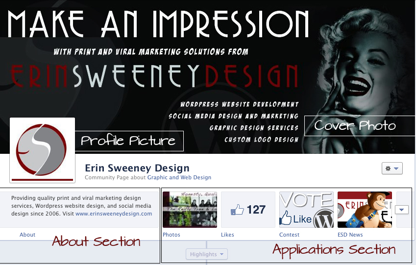
The top of the page is broken down into 4 very important elements. Before you publish your page in the new timeline, be certain that all 4 elements have been considered and are ready to go.
Cover Photo
The cover photo is the first impression you will make on the viewer. It needs to be visually striking and reflect your brand. One very important thing to consider is Facebook does not allow for any sort of call to action to be included in this cover image (i.e., “Click to like my page”) so be certain when you design the cover photo that it refrains from including a call to action. This also would include adding phone numbers and/or web addresses as part of the design. Any element that would require the user to perform another task is not allowed. Instead focus on a design that will grab the viewers attention and influence them to become a fan. The dimensions for the cover photo are 851 pixels x 315 pixels.
Profile Picture
This is basically a thumbnail. It is what will be seen on the newsfeed when you post from your business page. Be sure it includes your logo. It’s preferable that the logo is not cropped but displayed in full. The dimensions for the profile picture are 180 pixels x 180 pixels.
About Section
With the new timeline, this section is now prominent so take advantage of that. Previously this section was hidden in the sidebar. It is now a main focus on your page so be sure to use this opportunity to sell your brand! Include contact information here that could not be included on the cover photo such as a web address.
Applications Section
Another great improvement with the new timeline is the Apps section. Again, a section that was previously hidden is now front and center so utilize this to best sell your page and gain fans. The Photos app is standard and will always come first. At least for now that is one app we can not change. But we can move all of the other apps around where we want them so be sure the ones that are showing in the top row are the ones you want the viewer to notice. There is a drop down arrow to view additional apps that are not in the top 4, but the majority of your viewers will not click on this, so focus your efforts on the top line. Be sure to utilize relevant images for each app so they stand out.
Highlights
Some things to thank Facebook for as we transition our business page over to the new timeline:
- The new cover photo offers an excellent opportunity for us to really brand our page and make a strong first impression.
- The new About section is another opportunity for us to sell our brand and gain fans.
- The new timeline offers website-like navigation with the addition of the highlighted Apps section. Fans can jump from app to app.
- The width of the page has almost doubled, going from 520 pixels to 810, again allowing us an opportunity to make a strong first impression.
And That’s Just The Beginning!
The top of the page will get the viewers attention. But there’s more to your business page than what’s up top. We need to move down a bit to see the other changes coming our way.
Friends
The new timeline makes the Friends section more prominent. This section will display friends of the viewer that already like the page. Most people are more likely to follow the crowd. If their friends like the page, chances are they will to!
Pinned Posts
The new timeline allows us to pin a post. This means a post can be featured at the top of the page for a week at a time. When someone visits the page, the pinned post will be displayed at the top, keeping it fresh without having to create multiple postings. This is useful when running a contest on your page. To pin a post, click on the Edit or Remove link in the upper right hand corner and click “Pin to Top.”
Highlighted Posts
When you highlight a post, it creates a double-width of that post. This is a great way to jazz up your wall with cool photos and video. To highlight a post, click the star in the upper right hand corner. Again, this works well with visually appealing imagery to really decorate your wall.
More Highlights!
A few more things to thank Facebook for…
- The wall of your business page will now be more visually appealing with the addition of highlighted posts.
- Friends are now front and center which should boost viral growth.
- We are also able to manage the settings of the comments that fans are making that would show in the Friends section. We can uncheck show recent posts by others or choose to allow the admin to review comments before they post on your wall. This helps us control any negative comments that could hurt our brand image.
Some Things Never Change
With all this new progress, one thing remains the same: the newsfeed is still king. Most of your fans (9 out of 10 people only visit your page once) will see your brand through the newsfeed. What you post is what they see. Your Facebook marketing strategy needs to continue to focus on how you moderate, comment and interact with fans.
Take time to develop your game plan. Once you publish your page in the new timeline, there’s no going back. Enjoy the new changes and make the most of them. Good luck!


