The Power of a Logo
The Most Memorable Rock Band Brands of the Last 50 Years

The Most Memorable Rock Band Brands of the Last 50 Years
SOME LOGOS ARE SO RECOGNIZABLE THAT YOU DON’T EVEN NEED TO HEAR THE MUSIC TO KNOW WHO THEY BELONG TO.
Over the past five decades, rock bands have built some of the world’s most enduring brands—not just through their songs, but through powerful visual identities. Their logos have appeared on concert posters, album covers, T-shirts, guitars, tattoos, and merchandise around the globe. In many cases, the logo has become just as famous as the band itself. What makes these designs so successful? Simplicity, consistency, and a visual identity that captures the personality of the band. These are the very same principles that help businesses create memorable brands. Let’s take a look at some of rock’s most iconic visual identities and what they teach us about effective branding.
Few logos are as instantly recognizable as the famous tongue and lips. Originally created in 1970 by graphic designer John Pasche, the design symbolized rebellion, confidence, and attitude. More than fifty years later, it still feels modern and unmistakable.
BRANDING LESSON:
Great logos communicate personality. The Rolling Stones’ logo tells you exactly what kind of experience to expect before you hear a single note.

AC/DC didn’t need an elaborate symbol. Their bold, gothic lettering separated by a lightning bolt perfectly represents high-voltage rock and roll. The logo has remained virtually unchanged for decades, proving that consistency can become a brand’s greatest strength.
BRANDING LESSON:
Sometimes typography alone can become iconic when it reflects your brand’s personality.

Van Halen’s winged “VH” emblem evolved over the years while maintaining its recognizable structure. Whether fans preferred the original or later versions, the logo always communicated energy, movement, and musicianship.
BRANDING LESSON:
Brands can evolve without abandoning the visual elements customers already recognize.
The KISS logo is one of the most commercially successful band identities ever created. The sharp lightning-style “SS” lettering became synonymous with concerts, merchandise, comics, pinball machines, action figures, and countless licensed products. For millions of fans, wearing the logo became a statement of identity.
BRANDING LESSON:
A strong logo can become a lifestyle brand when it’s consistently applied across every customer touchpoint.

Metallica’s aggressive typography reflects the band’s intensity while remaining surprisingly simple. Its distinctive first and last letters create a silhouette that fans recognize from a distance.
BRANDING LESSON:
Memorable brands often rely on unique shapes that remain identifiable even without color.

The famous smiley face associated with Nirvana became one of the defining images of the 1990s. Its imperfect expression perfectly captured the band’s alternative spirit and resonated with an entire generation.
BRANDING LESSON:
Sometimes an unconventional design becomes unforgettable because it feels authentic rather than polished.
Rather than relying on one logo, the Grateful Dead developed several enduring symbols, including the “Steal Your Face” skull and the dancing bears. These graphics became visual shorthand for an entire culture, instantly connecting fans around the world.
BRANDING LESSON:
Strong visual systems can be just as powerful as a single logo when they consistently reinforce a brand’s identity.
While Pink Floyd has used several logos over the years, the prism from the album The Dark Side of the Moon became inseparable from the band’s identity. Its clean geometric design continues to appear on merchandise more than 50 years after the album’s release.
BRANDING LESSON:
Sometimes a single iconic image can become more recognizable than a traditional logo.
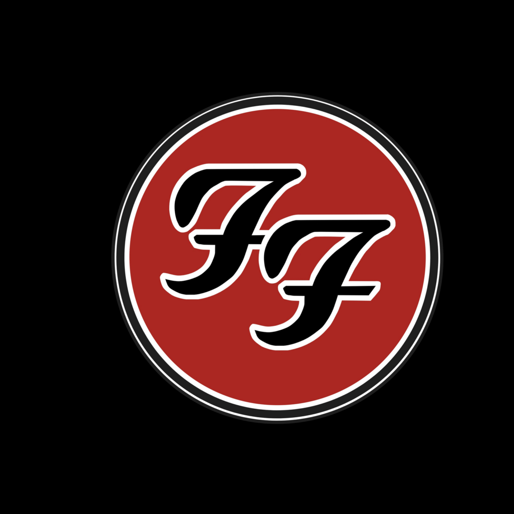
The double “FF” circle demonstrates that contemporary branding doesn’t need to be complicated. Clean, adaptable, and highly versatile, it works equally well on stage equipment, apparel, digital media, and social platforms.
BRANDING LESSON:
A simple mark often performs better across today’s wide range of digital and print applications.
Whether you’re selling music or professional services, memorable branding follows many of the same principles.
The most successful brands:
These bands understood that branding is more than decoration, it’s communication, and their visual identities helped shape how audiences perceived them.
A business logo may never appear on a stadium stage, but it performs every day.
It’s often the first thing a potential customer sees on your website, social media profile, business card, or storefront. Like the legendary rock bands who have stood the test of time, your visual identity tells a story before anyone contacts you.
The most memorable brands share one thing in common: they leave a lasting impression. And that’s what great design has always been about.
