Logo Love Series 1: Logo Fun Facts
Domino’s
Most famous logos have an interesting story behind them. Take the Dominos Pizza logo, for example. Domino’s began as a small independent pizza restaurant called DomiNicks. Tom Monaghan bought the business in 1960 with his brother. After buying his brother out a few years later (with a beat-up VW Beetle) he changed the name to Domino’s with plans to franchise it. His originally intention was to add a new dot to the logo each time a new store opened. Instead, the logo has only three dots to represent the first three stores opened under Tom’s management. If his original idea had gone as planned, there would be over 10,000 dots on the dominos today!
Starbucks
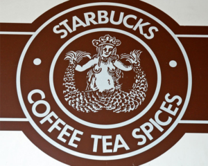
The original Starbucks logo was a bit too risqué for most consumers. While it’s undergone many transformations over the years, today it’s hard to see the original design was based on a 16th century woodcut of a topless two-tailed siren that was meant to be as “seductive as the coffee itself.” In more recent versions, her nudity is concealed. When the company released a “retro” version in 2006 to mark their 35th anniversary, they received much backlash, even though the image was far less revealing than the original.
McDonalds
Most people think the “golden arches” in the McDonalds logo represent the letter “M” for the name of the restaurant chain. Actually, the arches are based on the original design of the building by architect Stanley Meston. Meston designed the original restaurants to feature big golden arches as a way for the restaurant to stand out and be more visible from the highway. When the company decided to rebrand during the 1960s, they included the arches in their redesigned logo, creating one of the most well-known and recognizable logos on the planet.
Windows
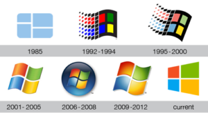
The Microsoft Windows logo has gone through various redesigns over the years. The logo initially looked like a window. Makes sense. But for some reason, designers reworked the window into a flag. Initially, the logo was changed from the original simple collection of squares to a pixellated flag because Microsoft wanted it to better represent the enhanced features that their new line of computers had. Over the years, the redesigns continued to have this flag theme, until a graphic designer sat down with Microsoft reps and simply asked “Your name is Windows. Why are you a flag?” With no real explanation, the designer decided to go back to basics. The logo was redesigned to look like a window. Perfect.
Apple
Steve Jobs decided on the name for his company while on one of his fruitarian diets. Jobs, returning from an apple farm, thought the name sounded “fun, spirited and not intimidating.” So, that explains the apple logo. So, why is there a bite in the apple? A rumor exists that the bite was in reference to “the father of computer science,” Alan Turing, who committed suicide after he was ostracized for being a homosexual. Some say he ate a cyanide laced apple. But Apple logo designer Rob Janoff has said he never intended it to be a tribute to Turing. It’s simply an apple. The bite? Janoff has explained he added the bite mark so it wouldn’t be mistaken for a cherry.
Disney
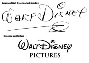
Did you know the Walt Disney logo is not based on the signature of Walt Disney but actually on an employee’s version of Walt Disney’s actual signature? With a company of that size, it was impossible for Disney to sign all of the fan mail that came pouring in. He often passed this task off to employees and secretaries. In addition, the artists who drew the cartoon panels used a stylized version of his signature to match what they’d seen Disney employees using. Pretty soon Walt Disney found it difficult to sign anything using his own signature because it didn’t match the one that had become more widely used. It’s believed Disney attempted to change his signature often in an attempt to make it more flowery and stylized to match the one used in Disney marketing. Finding a legitimate copy of his true signature has proven to be a difficult task.
MGM
Peace Sign
Coca-Cola
Stella Artois
Logo Love Series 2: Meet the Designers
Ruth Kedar for Google, Inc.
While a consultant art professor at Stanford University, Ruth Kedar was commissioned to design the Google logo. Google, Inc. founders Larry Page and Sergey Brin liked her preliminary idea for its playful design and uniqueness. Originally a student of architecture from Israel, she came to the US to attend Stanford University. As a graduate student at Stanford, Kedar did a master’s thesis on playing card design. She later went on to design the award-winning Analog Deck and Duolog Deck for Adobe Systems, a promotional deck of playing cards.
Lindon Leader for FedEx
The FedEx logo has been ranked as one of the 8 best logos of the past thirty-five years. The arrow (located between the E and the X) is what makes this logo design pure genius. Leader explained the development of the arrow in the quote below. As the logo designer, he had to consider how the typeface would work among different media. Something that appears so subtle actually took an enormous amount of thought, planning, and design:
“I was studying Univers 67 (Bold Condensed) and Futura Bold, both wonderful faces. But each had its potential limitations downstream in application to thousands of FedEx media, from waybills and embroidered courier caps to FedEx.com and massive signage for aircraft, buildings and vehicles. Moreover, neither was particularly suited to forcing an arrow into its assigned parking place without torturing the beautifully crafted letterforms of the respective faces. To avoid getting too technical here, suffice it to say I took the best characteristics of both and combined them into unique and proprietary letterforms that included both ligatures (connected letters) and a higher “x-height,” or increased size of the lower-case letters relative to the capital letters. I worked these features around until the arrow seemed quite natural in shape and location.”
Lindon Leader is a graduate of Stanford University and Art Center College of Design, and continues to lecture nationally on corporate identity and brand management topics.
Carolyn Davidson for Nike
Most everyone has heard the story of Carolyn Davidson, the graphic design student from Portland State University who was paid $35 in 1971 to design what is now considered one of the most recognizable brand logos of all time. A teacher (who happened to be a co-founder of a brand new company that would eventually change their name to Nike) had overheard her complaining she didn’t have money to buy the oil paints she needed for a class, so he suggested she do some work for what was then Blue Ribbon Sports, Inc. to earn some cash. He asked her to design a logo that “had something to do with movement”. She was actually the company’s designer until 1976 when they grew too large and had to hire an external advertising agency. In 1983, she was given 500 shares of Nike stock after the company went public. In 1995, Nike dropped the company name from their logo and go simply by the swoosh originally created by Davidson. In 2000, she retired and now enjoys keeping busy with hobbies and volunteer work, such as volunteering weekly at a Ronald McDonald House in Oregon.
Rob Janoff for Apple
In 1977, Janoff was asked by Steve Jobs and Steve Wozniak to create a logo for Apple products because of his extensive experience working with high tech clients as creative director at Regis McKenna. After the incredible success of the Apple logo design, he later worked for agencies in both New York City and Chicago, designing print and TV ads for both national and international clients. He’s now a consultant and educator, as well as advisor to design students from all over the world.
What does the designer of one of the most recognizable logos in the world think is the most important feature of a well-designed logo? “Simplicity. Too often clients have long laundry lists of elements the logo “must have.” That’s a recipe for failure. Logos need to be simple and distinctive or they won’t be remembered. The frequency that a logo is seen is a huge factor in its success. The fact that the Apple logo was on the corner of every screen of every Apple product helped to make it an internationally known (and loved) icon.”
Paul Rand for ABC, NEXT, Westinghouse, IBM, UPS and Enron
You can’t have a conversation about iconic logo designs without mentioning the name Paul Rand. Rand is the creative genius behind many of the most iconic logo designs of all time. In addition to designing corporate identities for numerous companies, Rand was a professor of graphic design at Yale University from 1956 to 1969 and again from 1974 to 1985. He spent the final years of his life doing design work and writing memoirs. He died of cancer in 1996 at the age of 82. According to graphic designer, Louis Danziger, Rand made graphic design what it is today. “He almost singlehandedly convinced business that design was an effective tool. [. . .] Anyone designing in the 1950s and 1960s owed much to Rand, who largely made it possible for us to work. He more than anyone else made the profession reputable. We went from being commercial artists to being graphic designers largely on his merits.”

