Logo Evolution
As a company grows, the need to change the company’s logo and give it a new direction, often times, will come into play. Here is a look at 5 well-known companies who’s logo changed over the years to reflect not only changes within the business, but changes in society in general. Logos are updated to stay contemporary, interesting, and to market the company in newer ways. Do the redesigns make you feel any differently about their brand, their product or their service?
Dunkin’ Donuts
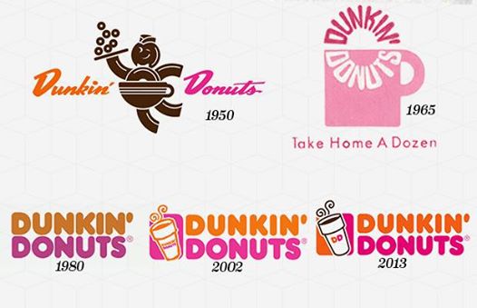
The Dunkin’ Donuts logo was first introduced in 1950, and was a script version of the company name. This held until 1955, when the doughnut man became a figure with a doughnut for a head holding a slice of pizza and wearing a coffee cup with the company name written on it. In 1960, a new logo was introduced featuring a text donut being dunked into a coffee cup. Only a year later the coffee cup was removed and became circular text. From 1970-1976, Dunkin’ combined the older coffee cup text logo and a simple text logo. In 1976, the modern-looking logo was created and has been used ever since with slight color improvements over the years.
Volkswagon
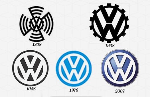
The logo for Volkswagen was first introduced in 1938. It began as a Porsche office competition to see who could come up with the best one. Designer Franz Reimspiess won with a black and white logo strategically containing the VW for Volkswagen, as well as a swastika which was in accordance with Hitler’s regime. The second logo stays black and white but the swastika is removed, and it resembles a wheel in comparison to the fan or radar represented before. Post-WWII, the British took over the car company, renamed it the Beetle, and changed the logo. They kept the VW but got rid of the design of the circle, which was inspired by the Nazi flag. The company was eventually returned to the German government. The most recent logo is embossed in blue and grey contrasting the black and white logos of the company’s past.
NBC
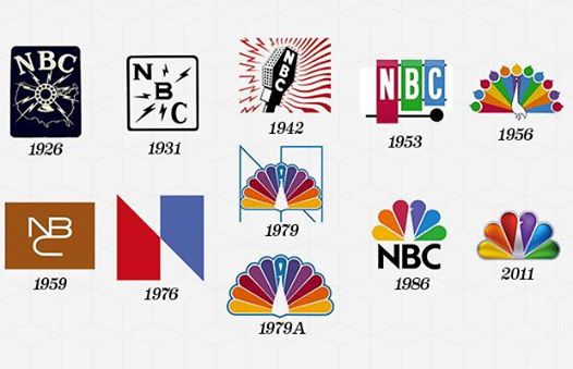
The first logo for NBC was introduced in 1926, a blue rectangle with a broadcasting microphone over America and NBC above it in bold letters. By 1931, the logo was simplified. It became black and white and the image of the microphone over America was removed. The 1940’s saw a more stylized logo design with red colored sound waves. During the early 1950s, a xylophone and mallet with the letters NBC became the logo. Then in 1956, the infamous peacock was introduced. By 1959, the “NBC snake,” a brown box with a styled “NBC,” was the logo. This lasted for 16 years. A new logo with an abstract capital “N” letter appeared in 1976 but only lasted four years. In 1979, the peacock made its return as the logo, with a contemporary spin. The final logo we see today is widely known as the NBC peacock; the company name is no longer necessary. Talk about logo evolution!
IBM
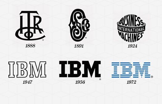
IBM began as the Computing-Tabulating-Recording Company and, in an attempt to modernize, changed its name to International Business Machines in 1924. The IBM logo introduced in 1924 was an updated version of the 1911 CTR logo. The logo was configured to mimic a globe, emphasizing the “International” in IBM. With the modernization of the company’s technology, the globe logo was replaced with a simplistic “IBM” in 1947. This remains the symbol of the company to this day. In 1956, graphic designer Paul Rand transformed the outlined logo into a solid black “IBM” to impress stability and balance. In 1972, Rand returned to update the image of the company from solidity and stability to “speed and dynamism” implied by a striped logo.
McDonald’s
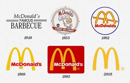
One of the most recognizable logos all over the world today is the Golden Arches of McDonalds, but that wasn’t always the case. When McDonald’s first came to be in 1940, it was known as “McDonald’s Famous Barbecue.” In 1948, it became “McDonald’s Famous Hamburgers,” and the logo featured a slightly creepy illustration of a cook. From 1953-1960, a character named Speedee served as the mascot for the franchise. In 1960, the Golden Arches were born. Artist Jim Schindler drew on the architecture of the McDonald’s restaurants, designed by architect Stanley Meston, for his design of the two arches forming an “M” with a dash cutting across. The company simplified the M in 1968, the arches were placed atop a red background, the logotype became white, and the arches went back to being golden. Then in 2003, McDonalds introduced its most simplified logo of all time, a plain and iconic golden “M.”

