
The psychology of color as it relates to persuasion is an important factor when developing a color scheme for any business. Color development is vital since color plays a substantial role in purchases and branding. Color can sway our way of thinking, cause us to react, and is a powerful tool when it comes to communication. Read more to learn how some of the more popular colors are perceived, and how those perceptions generate the power behind the logo design.
The Psychology Behind the Color Red
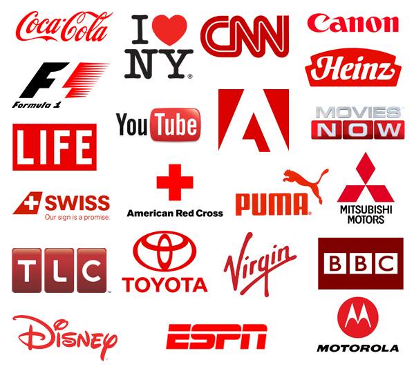
The color red is a powerful color used in design, not only because it quickly captures the viewers attention, but it elicits many physical and psychological responses. Physiologically, it has been shown to increase heart rate and raise blood pressure. This stimulating attribute actually excites our appetite, making it a very popular color for restaurants and any food-related product or service, such as McDonalds, KFC, and Pizza Hut.
Depending on your product or service, red can be a highly influential color when used properly. On the positive side, it evokes feelings of power, intensity, passion, excitement, courage, assertiveness, and confidence. It can also evoke feelings such as aggression, anger, violence, and brutality. Incorporating variations of red into your branding (e.g., a dark red for luxurious or a bright red for excitement) to target and express the proper message can be very powerful.
Psychology Behind the Color Blue
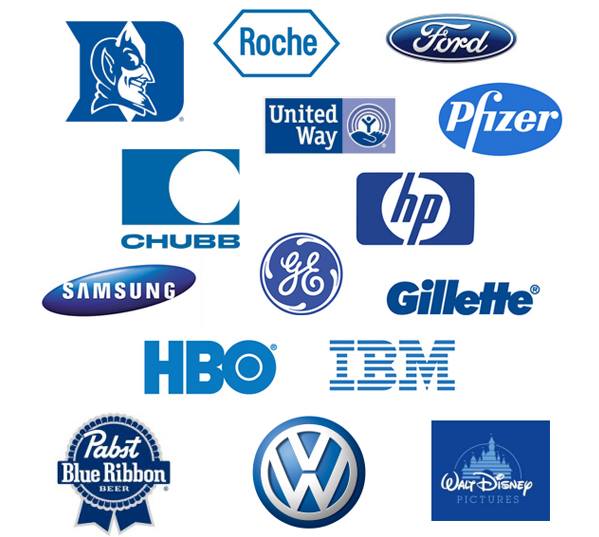
Blue elicits both physical and psychological responses. Physiologically, it has been shown to calm nerves by causing our bodies to produce chemicals that soothe. It’s also known to aid intuition. In addition, the color blue promotes productivity. Research has shown that people are more productive in a blue room compared to any other color.
Blue is the least gender-specific color. The majority of both men and women prefer blue over other colors. It’s a good color to work with because of its popularity, as well as the fact that it mixes well with other colors. It cools warm colors when used as an accent, and can brighten up blacks and grays.
When used in logo design and branding, blue is seen as trustworthy, committed, and dependable. It’s a tranquil color, and is associated with intelligence, serenity, reflection, calm, truth, loyalty, and confidence. Blue is often used for healthcare industries, financial institutions, and large corporations. One industry that should avoid using blue is the food industry since blue is considered the least appetizing color for food.
Psychology Behind the Color Green
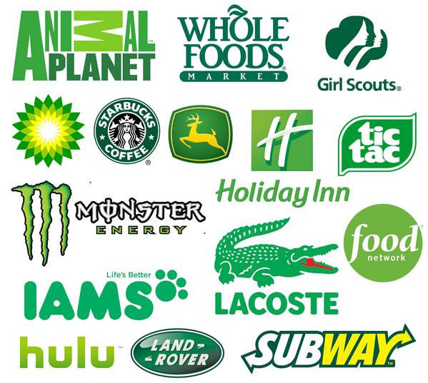
Green is the color that represents growth, vitality, balance, harmony, new life, and renewal. Physiologically, it is said to elicit a sense of calm by balancing our emotions. In addition, by allowing us to see all sides clearly, it aids in decision-making.
Green is often associated with nature, health, healing, the environment, reliability, generosity, and practicality. It encourages generosity, kindness, and sympathy. Since green can sometimes be seen as envious, greedy, and materialistic, in design it’s important to use a shade of green wisely, and in some cases, include an accent color.
Darker greens are used for financial groups or businesses related to money, while lighter greens relate more to businesses focused on growth, health, and freshness.
Psychology Behind the Color Yellow
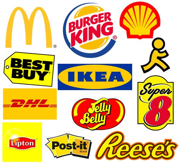
Yellow resonates with the logical (left) side of the brain and stimulates mental faculties, creating mental agility and perception. It’s believed the color yellow inspires original thought, generating new ideas and helping us find new ways of doing things.
Yellow encourages feelings of hope, happiness, cheerfulness, and fun, while creating an enthusiasm for life. In addition, it evokes feelings of confidence and optimism.
As the most visible of all colors, it can be tricky to work with in design. It’s believed, when viewed, the color creates a series of fast vibrations in our brains, and can potentially leave viewers feeling stressed. It’s highly recommended that any industry working with the older population avoids using yellow in their branding. You will, however, find yellow often used in children’s products since it stimulates their minds and creativity. In logo design, yellow is meant to encourage people to move quickly (e.g., many fast food chains use yellow in their branding). It is a color that draws attention and is often seen in emergency signs, or even special ads and promotions.
Psychology Behind the Color Purple
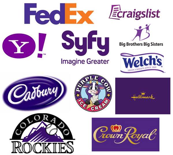
Purple is about imagination, creativity, and spirituality. It is a harmonious color, creating a sense of mental balance and stability, while linking us to both the spiritual and physical worlds. Physiologically, it increases our sense of beauty and encourages us to react to creative ideas. There is a magic and a mystery that surrounds the color purple. It is unique, powerful, and independent.
Historically, purple has been associated with royalty and the nobility as it displays a sense of wealth, luxury, and elegance. In design, it’s often used to denote something that is high-quality or superior. You’ll find many businesses in creative fields, as well as the cosmetic industry, use purple as it encourages creativity and beauty. Incorporating purple in a logo means you are inventive and sophisticated. It’s also a color that works well with a number of other colors, such as gold, turquoise, deep red, and yellow to create a uniquely contemporary look.
Psychology Behind the Color Orange
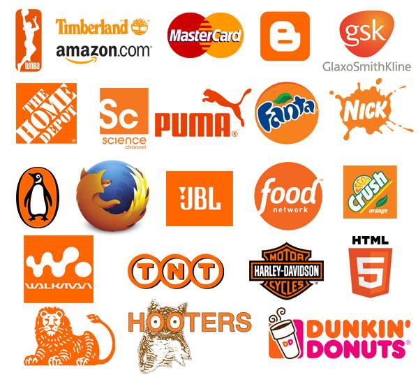
Orange is fun. It’s energetic, vibrant, and warm. It is a color associated with the risk-taker, the extrovert, and the uninhibited. In color psychology, it means adventure, self-confidence and sociability. Physiologically, orange inspires us and makes us feel enthusiastic. It stimulates our appetites, therefore working well for restaurants and other food outlets. An upscale restaurant benefits from a more elegant and subdued version of orange, while brighter tones work well in more casual and fun environments.
Too much orange or the wrong shade can evoke a sense of cheapness or being superficial, so it’s best to combine with other colors such as purple or blue for a unique, contemporary and classy look.
Psychology Behind the Color Brown
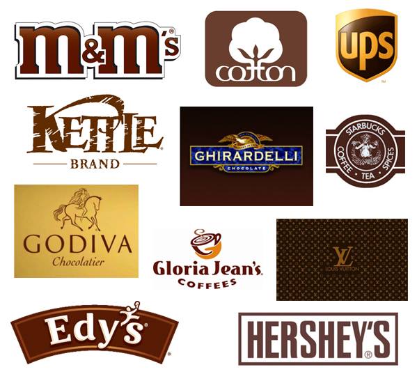
Brown is honest, genuine and sincere. It is associated with strength and solidarity, as well as comfort and earthiness. As a frugal color, there is no frivolity or excess connected to brown. Physiologically, brown evokes feelings of reassurance and comfort. As the predominant color on the planet, it is comforting and stabilizing.
Brown is often seen in logos that pertain to industries considered hardworking and reliable, suggesting a sense of endurance and duty. The company that uses brown in their branding is one that values quality above all else. They are serious, down-to-earth, stable, structured, and supportive. In the meaning of colors, brown is material security and an accumulation of material possessions. Brown isn’t the life of the party. But it is a reliable, stable, and trust-worthy color.
Psychology Behind the Color Pink
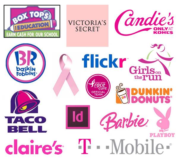
Pink is associated with compassion, nurturing, love, and romance. Soft pink is considered feminine and youthful, while deep pink is associated with passion and energy. Physiologically, pink calms us, alleviating feelings of anger and aggression. Pink evokes feelings of hope, sweetness, and understanding.
Pink is often used for businesses related to cosmetics, fashion, beauty, and romance. While certainly the color known for representing charities involved in breast cancer awareness and support, pink is also used for other charities because the color generates feelings of compassion. Pink also works well for candy stores or any business that sells sweets. In design, pink can be controversial. It is a color that can be both loved and hated. But one thing pink is not is mediocre. When used with colors such as blue, purple, gray or black, pink can be powerful.
Psychology Behind the Colors Gray and Silver
Gray is a neutral and conservative color. Gray is solid, stable, calm, and composed. Physiologically, gray can drain our energy, even depress us. But, it can also be a stable base. It is the relief from a chaotic world. Being neither black nor white, gray is the color of compromise. The darker the gray, the more dramatic it becomes.
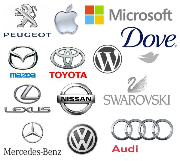
When gray is lightened, it becomes illuminating and lively. Silver has a way of cleansing our minds. It opens doors. It inspires intuition and calms us. Psychologically, silver is dignified and determined. As a color, it is associated with wealth and prestige (notice many luxury car companies use silver in some capacity). Silver is glamorous and sophisticated. It is hi-tech and modern. Though exhibiting a similar energy when compared to gray, silver is more light-hearted and optimistic.
Psychology Behind the Color Black
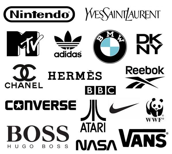
Black is mysterious and secretive. It is powerful and controlling. Psychologically, it gives off an impression of elegance and sophistication, as well as authority, credibility, strength, and professionalism. Physiologically, black intimidates us because of its mystery and intensity, but it also interests us for the same reasons.
The color black is popular among the youth and young adult market, so many businesses who target that age group will incorporate black into their branding. It is also the preferred color of high-achievers and overly ambitious individuals. Too much black, however, can be depressing. Adding colors such as red, emerald green. bright blue, gold, or silver will make the black more dramatic. Black is often used in the construction, corporate, oil, financial, fashion, manufacturing, cosmetics, mining, and marketing industries.
Was this article helpful or informative? Please Like or Share. Thank you!
[fb_button]
