The Best Album Covers of All Time
What makes an album cover great?
The thought processes and design concepts behind album cover design has always fascinated me. Artwork can be as much a part of a record as the music itself. In 1938, the concept of album covers and cover art was invented when Columbia Records hired its first art director, Alex Steinweiss. A successful album cover has to capture the audience’s attention while reflecting the soul of the artist and the essence of the music. Recently, I was browsing through numerous articles online discussing what are considered some of the best album covers of all time. I found that a number of the same covers were featured on multiple lists. I wondered what makes these album covers stand out from the multitude of covers that have been designed over time. In many cases it’s the story behind the design. Every cover has a story. I’ve gathered the covers that I’ve seen most often appear in these “best” lists and collected them here. Do you agree these represent some of the best album cover designs in music?
AC/DC
Back in Black, 1980
AC/DC’s Back in Black, released in 1980, followed the untimely death of lead singer Bon Scott at the age of 33 and marked a turning point for the group. After battling issues with both alcohol and drug addition, Scott died in February of 1980. After Brian Johnson joined the band to replace Scott, and less than 6 months after Scott’s death, they released Back in Black which has become the band’s most successful album, as well as the 2nd best selling album of all time. Though Atlantic Records disagreed with the cover, they accepted it with the condition that the AC/DC logo would be outlined in grey. The album serves as AC/DC’s homage to Scott, with the album cover in solid black as a symbol of mourning their loss. Back and Black is arguably one of the greatest rock and roll albums of all time.
The Beatles
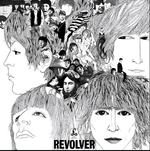
Revolver, 1966
German-born artist and musician Klaus Voorman was a longtime friend of the Beatles when they asked him to draw the Revolver cover. After listening to their new track “Tomorrow Never Knows,” he sketched his first draft. He felt the band was so “avant-garde” and wanted the cover to be as strange and surreal as possible without going too far. The artwork was partly-drawn and partly made as a collage and inspired by the works of nineteenth-century illustrator Aubrey Beardsley who’s work was highly influential on 1960s fashion. Voorman asked the members of the band to give him old photos of themselves. He pasted some of them onto his own drawings. Each of the Beatles’ members is depicted seemingly in another state of consciousness.
The Beatles
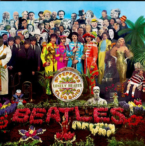
Sgt. Pepper’s Lonely Hearts Club Band, 1967
Pop artists, Peter Blake and Jann Haworth designed the cover for Sgt. Pepper’s Lonely Hearts Club Band. The original idea was to show the Beatles in their Sgt. Pepper’s outfits playing in a park. That slowly evolved into a concept where they stand amidst 58 cardboard cutouts of their heroes representing a fascinating cross-section of cultures, importance, and each Beatle’s individual interests like Marlon Brando, Karl Marx, and Marilyn Monroe. The famous crowd behind The Beatles were all cardboard cut-outs. The figures of the band themselves are wax sculptures borrowed from Madame Tussaud’s museum. Mae West initially refused to be included wondering “What would I be doing in a lonely hearts club band?” The Beatles were able to change her mind after sending her a letter explaining the concept. This cover has influenced everyone from Frank Zappa (We’re Only In It For The Money) to The Simpsons (The Yellow Album). Both John Lennon and George Harrison had requested Adolf Hitler, Jesus Christ, and Mahatma Gandhi be put in right beside them. However EMI feared controversy and refused their wishes. This album cover is, without a doubt, one of the most iconic images in the history of rock & roll.
The Beatles
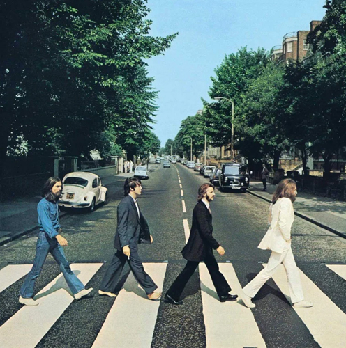
Abbey Road, 1969
Abbey Road is probably the most widely imitated album cover throughout the music industry. Here, you can see the band strolling across a street near Abbey Road’s record studio. The legendary photo of the band strolling across a street near Abbey Road’s record studio was based on ideas and sketches by Paul McCartney. Photographed by Iain Macmillan, he had only ten minutes to take six photos while a police officer held the traffic behind him. Hundreds of fans continue to re-create this photo every day outside Abbey Road Studios. This photo left many fans wondering if the rumors that Paul had died in 1967 were true. Many believed this was a funeral procession with John (in white) as the preacher, Ringo (in black) as the mourner, George (in denim) as the grave digger, and Paul (barefoot) as the corpse. None of that was intended. Interesting fact: Abbey Road is the first Beatles cover that doesn’t feature the band’s name or album title.
The Clash
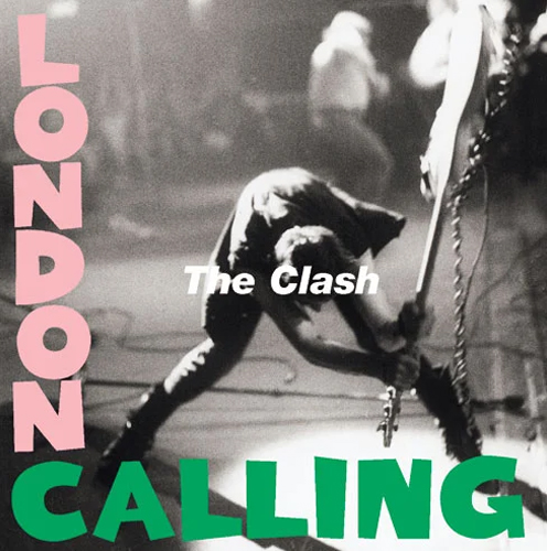
London Calling, 1979
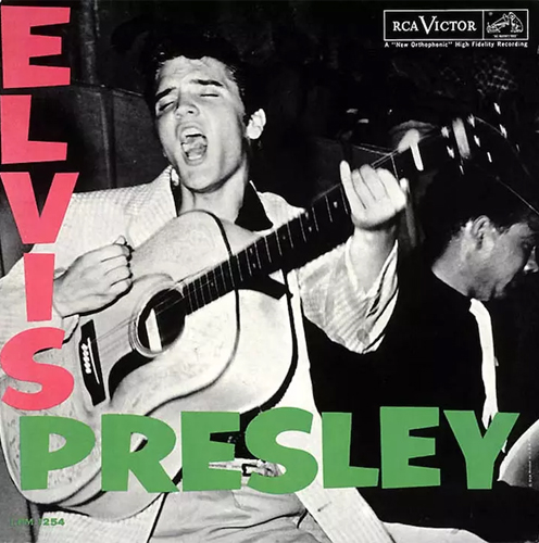
London Calling is the third album by English rock band The Clash, and shows the band’s bassist, Paul Simonon, smashing his Fender Precision Bass onstage. This is considered one of the most iconic photos in rock history. Story has it Simonon was annoyed that the audience was relatively quiet so he began smashing his bass on stage. Designed by Ray Lowry, the cover pays homage to Elvis Presley’s self-titled album (which is also on this list). While paying tribute to Elvis, The Clash is blowing up his version of rock n’ roll. The smashed bass now resides at the Rock and Roll Hall of Fame in Cleveland, Ohio.
David Bowie
Alladin Sane, 1973
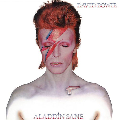
While this isn’t the album that introduced the world to David Bowie’s space-man alter ego, when music fans think of Ziggy Stardust, this is the image they see. The lightning-bolt eye makeup and the red mullet are quintessential Bowie. Brian Duffy shot this iconic image that, to this day, is viewed as the image most associated with David Bowie. His Aladdin Sane persona was an extension of Ziggy Stardust. The lightning bolt crossing Bowie’s face was copied by Duffy and makeup artist Pierre Laroche from a National Panasonic rice-cooker that happened to be in the studio during the shoot. The teardrop on Bowie’s clavicle was an addition that makes Bowie seem both mysterious and tender at the same time. Interesting fact: Though Bowie is iconic for the lightning bolt, this was the only time he was pictured with it drawn on his face.
Elvis Presley
Debut album, 1956
Released in 1956, Elvis Presley was the debut album by the singer. This iconic design was echoed on the albums by The Clash, F-Punk, and Chumbawamba, and others. This mid-strum snapshot of a vocal howl visually introduced rock n’ roll to an unsuspecting America even before they heard Elvis sing. Two simple words: “Elvis” and “Presley” was all it needed to say. This photo was taken during a performance at the Fort Homer Hesterly Armory in Tampa, Florida on July 31, 1955. You can feel the primal rock’n’roll energy from a young man ready to take over the world.
Fleetwood Mac
Rumours, 1977
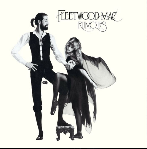
Rumours is the eleventh studio album by Fleetwood Mac and their biggest selling album. At a glance, we see drummer Mick Fleetwood along with Stevie Nicks channelling the Rhiannon muse that consumed her for a period in the mid-70s. And hard to miss the reference to Mick’s manhood portrayed by actual toilet chains he had pulled from a cistern before performing one of their earliest gigs. It’s been said he continued to wear these chains while performing live. The reason behind that only Mick knows. Though infamous for their group dynamic, this cover design includes only 2 of the 5 band members. Almost every member of the band was going through a tumultuous breakup or divorce at the time (many with each other), and that drama and intrigue is definitely being played out throughout this album and its cover art. Fleetwood Mac was a band who dated, fought, and broke up. Rumours is known to be based on much of that drama.
Led Zeppelin
I, 1969
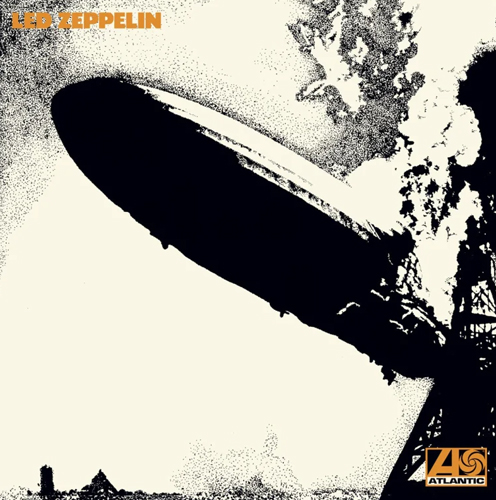
Led Zeppelin’s debut album, released in 1969, included a controversial image of a burning Hindenburg on its cover. The image, chosen by Jimmy Page, was based on the original photo taken by Sam Shere from 1937 and was slightly altered to fit the band’s vision. While many felt this was the perfect visual introduction to Led Zeppelin’s debut masterpiece, a Zeppelin erupting into flames moments before plummeting to the ground and killing dozens on board left a number of others feeling this image was nothing short of shocking. Whether seen as an indication of the explosive music on the album, or a heartless way to capitalize on a real-life tragedy, this black and white rendering of the disaster has become one of the most indelible images in hard rock, as well as launched the now famous band into popularity. Artist George Hardie was paid $76 to create this now-famous drawing. He has since come out and said he wished that he would have put more thought into using an image of a tragic event.
Nirvana
Nevermind, 1991
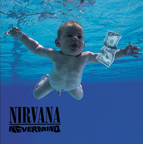
While some consider Nevermind one of the most recognizable album covers of all time, it’s also a sad statement about the values our society passes on to our youth. However Geffen Records art director Robert Fisher explained it was the result of Kurt Cobain’s fascination with underwater births after watching a documentary. The record label originally pushed back on the idea, saying they did not want to show a baby in the buff. So Kurt was willing to compromise with the strategic placement of a sticker that read “If you’re offended by this, you must be a closet pedophile.” Nevermind was not expected to be the major hit that it was. But in the end, this album cover fit Nirvana’s energy perfectly. Similar to The Notorious B.I.G. album, the baby on the cover represents innocence. Passing on superficial values in our society to our children is just the kind of statement that Nirvana made with their music. Not surprising that the cover design has inspired endless satires.
The Notorious BIG
Ready to Die, 1994
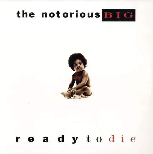
The innocence of a baby-sized Biggie (Christopher Wallace) on the cover of his classic debut Ready to Die vastly contradicted the music inside. This album used the innocence of a child to trace his life from beginning to a foreshadowing end. It illustrated how young minds can be molded in a cruel world. The blank canvas showing a small child wearing only a diaper is a statement about innocence, new life, and vulnerability = the life cycle of an artist.
Pink Floyd
Dark Side of the Moon, 1973
The cover design for Dark Side of the Moon, Pink Floyd’s 8th studio album, features a prism with a light beam projecting through it stands for three elements: the band’s stage lighting, the album lyrics, and band member Richard Wright’s wish for ‘a simple, bold, and classy’ design. Designer Storm Thorgerson explained Rick Wright suggested we do something clean and graphic. Not photographic.” This design was so successful and iconic that the prism has become synonymous with Pink Floyd itself. Interesting note: This was the first time that Pink Floyd felt confident enough of Roger Waters’ lyrics to print them on the album’s sleeve.
Pink Floyd
Wish You Were Here, 1975
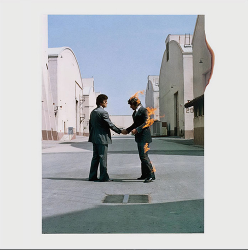
The follow up to Dark Side of the Moon, Wish You Were Here was also designed by Storm Thorgerson. The design plays on the idea of fearing showing your true feelings so as not to ‘get burned.’ Which is why we see one of the businessmen in the photo literally on fire. The men shaking hands are Hollywood stuntmen Ronnie Rondell and Danny Rogers. Though they worked on nearly 200 movies, including Speed, Titanic, Beverly Hills Cop, Bad Boys and Waterworld, they remain best known for this single photograph taken on the Warner Bros. backlot in 1975. Rondell wore a business suit over a flame retardant suit and shook Rogers’ hand. Despite all the precautions, at one point during the shoot, the wind blew in the wrong direction and briefly spread the flames to Rondell’s moustache. But it was worth it. Such an iconic album cover.
The Rolling Stones
Sticky Fingers, 1971
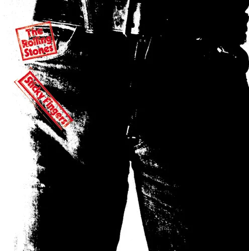
The first of two album covers designed by artist Andy Warhol on this list is Sticky Fingers. The Rolling Stones had approached Warhol asking him to create the cover art for their upcoming greatest hits album, Through the Past, Darkly (Big Hits Vol. 2). At the time he developed a concept of incorporating a working zipper on an album cover. This came to fruition on the cover of Sticky Fingers. The Stones were given the freedom and budget to mass-produce this cover with an actual zipper. When unzipped, it revealed white underwear with the Rolling Stones’ tongue logo on it. This was the first album to feature the iconic tongue and lips logo which later became the central icon for the band. The man in the underwear is not Mick Jagger, though that’s what’s believed. It’s actually one of Warhol’s associates. This design would go on to earn a Grammy Award nomination for best album cover.


