

ESD Logo Evolution
We are always evolving. Whether it’s hair styles or logo design, it’s ok to change. Many business owners worry about changing their logo after they’ve had it for years. It’s recognizable. It’s comfortable. It’s accepted. Will our target audience like the change? Will it change the way potential clients and customers view us? Is it smart to change branding after it’s been established? Absolutely. If your logo is no longer properly reflecting who you are and what you do, it’s time for a change. As our businesses change and evolve, so should our branding. A number of well-known companies have changed their look over the years. Huge companies like McDonald’s and IBM have had multiple rebranding efforts (see my article Logo Evolution). Though no where near as big, I recently took a look at the evolution of my own branding over the years and was surprised to see the changes that took place. To me, these changes are reflective of the changes happening in me while I was learning how best to present myself to grow my business.
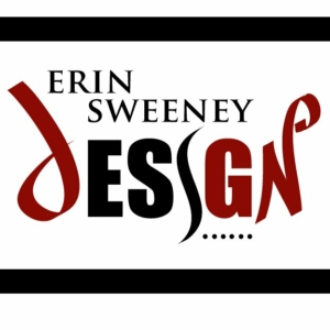
I started Erin Sweeney Design in 2006. A time when I was still learning about myself and what I wanted out of my business. Initially, I wanted a design that represented me as a graphic designer. I developed a logo design that incorporated various fonts and brush strokes. I wanted to focus on the word “design” more than my own name. I also chose red, black and white for my branding colors. This was the result:
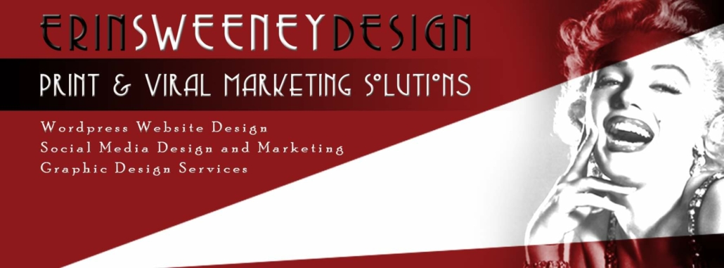
To be honest, this design didn’t last long at all. Not long after I designed this, I felt that it was too busy and complicated. I decided to redesign the logo so it was more a reflection of my interests. I liked the idea of something classic. Something cool and old Hollywood. I decided to incorporate a Marilyn Monroe vibe in my logo. I chose to use the font Copesetic because I liked the look and feel of it. In addition, I separated the words in my business name by color. Also at this time, I started using a black and white image of Monroe in my marketing.
While I liked the look of this, it didn’t really show what I do. I quickly decided to nix the Marilyn Monroe reference from my marketing but kept the font and the same color scheme. I also created a graphic that included the initials of my company, ESD.
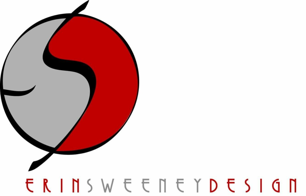
While I still liked using red and gray in my branding, I began to feel like the black was too much. I wanted a softer look to my logo so decided to remove black altogehter. In its place, I added a lighter shade of gray. I also added white to the letter S.
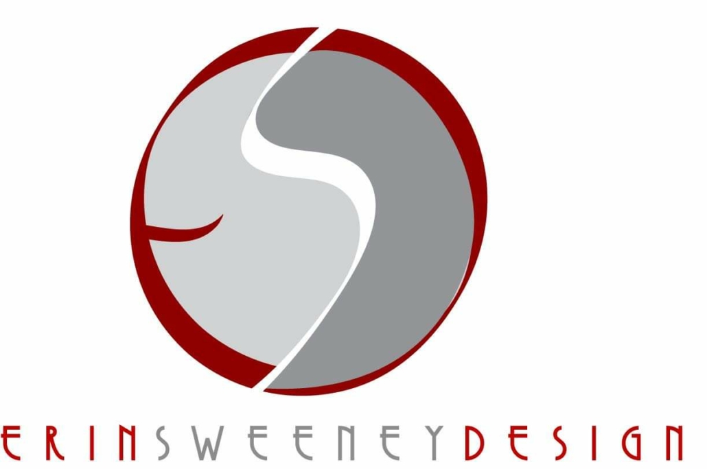
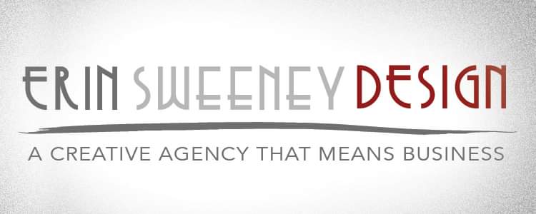
This version stood as my logo for more than a decade. I liked it. I like the white swoosh. I liked the clean look of the letter spacing. I liked the colors. In 2017, I decided to give my symbol a little tune-up. I cleaned up the illustration and added a solid bar to form the letter E versus the brush stroke I’d used up to this point. I also added the word “CREATIVES” under my symbol. I was working with other creatives on some of my projects: copywriters, photographers, social media experts, etc. I felt that incorporating CREATIVES in the logo better explained what my business was about.
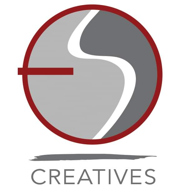
At this same time, I updated my full logo with the tagline “A Creative Agency That Means Business.” I wanted my message to be that I was a one-stop shop for business owners. I was the one who could do website projects and graphic design jobs. However, I was also a designer who was able to reach out to other professionals to offer more services for my clients.
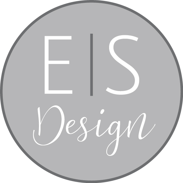
Recently, after so many years using the Copasetic type style, I felt it was time for me to bring my logo up to date. I wanted to thin out the font. Make it cleaner. More contemporary. I wanted to separate “Design” from my name. I wanted the updated design to be a better reflection of who I am today. At this point in my career, I’ve designed more than 75 different logos for every kind of business and every type of business owner. Because of this, I’ve learned a few things about my own business. I still feel that gray and red work well for me so I’ve kept that in this newest evolution of my logo. The biggest change is a completely new font which I love.
With this most recent redesign of my logo, I had to update the ESD symbol as well. I needed to lose the chunky thick lines and dark coloring to make it more airy and light. I decided to simplify it using only gray and white, and created the E and S using the new font (Julians Sans One).
And that’s it. The evolution of my logo over the last 13 years. Whether the changes were minor or major, looking back at them in this way shows me not just the evolution of a logo design. It shows me how I’ve evolved as a designer and as a business owner over the years. As every business owner knows, it can take a while to get to where we want to be. My design skills and the level of trust I have in myself as a designer has grown since I started. I like where I am now. Though who’s to say? Maybe I’ll feel the need for another overhaul in the future. But for now, I’m happy to present my new look.
