Buffalo Sabres
Original owners of the Buffalo Sabres, Seymour Knox III and Northrup Knox, wanted something different and unique when it came to choosing the name of their professional ice hockey team. They organized a contest with the winning name (Sabre: a heavy cavalry sword with a curved blade) coming from Harry Cole, a Toronto filmmaker. As the Buffalo Sabres, the team is “renowned as a clean, sharp, decisive and penetrating weapon on offense, as well as a strong parrying weapon on defense.” In this case, this logo depicts both its city and its nickname. Pretty cool.
Milwaukee Bucks
In 2015, the logo for the Bucks was redesigned. Team owners wanted to retain the green but lose the red, feeling the old look had a “Christmasy feel” to it. Designers went with cream because Milwaukee is known as the Cream City, a description of the pale yellow bricks used on many city buildings. In addition, when considering color theory, cream is a perfect compliment to green. Though deers aren’t typically tough looking animals, illustrators were able to create a strong deer image after working with an artist who solely did research on deer antlers. What’s interesting in this design is the inside of the antlers suggests a basketball, which was an accidental element of the design. The Bucks had not requested a basketball be included in the logo design, but artists, through multiple renderings of various sets of antlers, discovered this hidden gem and developed it further. There’s also an M (for Milwaukee) hidden under the buck’s chin which was another happy accident. As artists developed the chest of the deer, they noticed it resembled an M and stuck with it.
Portland Trailblazers
Considered one of the most conceptual logos in all of sports, the meaning of the Portland Trailblazers logo design is rather simple. It is a modern graphic interpretation of the game of basketball, showing five players from one side playing against five players from another. Originally designed in 1970 by Frank Glickman of Boston, cousin of Trailblazer’s founder Harry Glickman, this pinwheel concept was updated slightly in the early 2000s by tilting the the graphic 45 degrees to show the motion of the game, but other than that, the logo has stayed true to it’s original design for close to 50 years.
The 1948 Los Angeles Rams
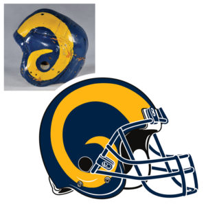
The 1948 logo for the Los Angeles Rams is arguably the most important football logo in history when the Rams became the first team to use an insignia or logo on their helmet. Fred Gehrke, a Rams player who also happened to be an artist, spent the season of 1948 hand-painting yellow Ram horns on 70 leather helmets. In 1949, Riddell, the manufacturer of the plastic football helmet, agreed to add the logo design to the Rams helmets. This encouraged other teams to start adding logos of their own to their helmets, starting a trend that continues today. Though the original design has changed over the years, the 1948 painted Ram horns stands as the most innovative and influential logo in sports.
Pittsburgh Steelers
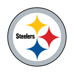
In 1962, Republic Steel of Cleveland approached the Steelers and suggested that they consider the Steelwork (an insignia used by the American Iron and Steel Institute) as a helmet logo to honor Pittsburgh’s steel heritage. The Steelwork is a circle enclosing three diamonds with inward-curving edges known as hypocycloids. U.S. Steel Corp. had created this insignia as a way of educating consumers about the importance of steel in their lives. The PittsburghSteelers liked the idea and began wearing helmets with the new logo during the 1962 season. They qualified that year for their first-ever postseason game and believed their new logo had brought them good luck! Originally their helmets were gold so they only sported the logo on one side of the helmet, unsure if they were going to like the look of it on gold. They later switched to black helmets but kept the logo just on one side. Today, the Steelers are the only team in the NFL to sport its logo on only one side of the helmet.
Philadelphia Flyers
Phyllis Snider, sister of team owner Ed Snider, came up with the name “Flyers” at a rest stop on the New Jersey Turnpike. She was traveling with a group of the original founders when they were kicking around names. She has said she imagined people flying across the ice, thought of the word “Flyers,” and it instantly stuck. Mostly unchanged since it’s original design in 1967, the logo was created by Philadelphia ad man, Sam Ciccone. Not much is known about the development behind the logo since everyone involved in the project have long since passed away, but original Flyers’ founder, Bill Putnam, has suggested it was based on a flying puck. The founders had wanted a warm color (for marketing reasons) but red was already being used by the Red Wings and Canadiens. So, they decided on orange for personal reasons. Putnam had been a quarterback at the University of Texas and wanted to include orange and white in the logo as a symbol of his alma mater. The Flyers produced an updated logo in 2006, but it received such negative feedback (you can’t mess with perfection) that they returned to the original design. It’s remained the same ever since.
New England Patriots
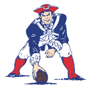
The New England Patiots logo has evolved over the years, from the tri-corner hat design in 1960 to the Flying Elvis that’s been the team logo since 1993. However, it’s the illustration known as Pat the Patriot which debuted in 1961 that stands (or, in Pat’s case, crouches) as both the fan and the player favorite. Pat was illustrated by Boston Globe cartoonist Phil Bissel during a series of cartoons he created for game day programs. Bissel created Revolutionary War figures “wreaking havoc” on the Patriots opponents. Team owner at the time Billy Sullivan was impressed with this particular illustration and, after being given the rights to it by the Globe, named it the teams’ official logo. Pat the Patriot served as the Patriots logo for 3 decades before being replaced with the Flying Elvis of today, which left many fans disappointed, longing for the return of the grimacing Patriot. Bissel explains why his illustration is such a dearly-loved and nostalgic piece of New England sports: “Things are going so fast today. People like to have their feet on the ground, and my old Pat, when I drew him back in 1960, he had both his feet on the ground. He was ready to do battle.”
Golden State Warriors
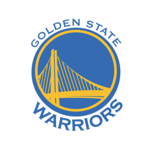
When the team moved from Philadelphia to San Francisco in 1962, they retained the name Warriors. In 1969, they began using what was referred to as “The City” logo which was a visual of the Golden Gate Bridge. Then in 1971, the team moved to Oakland and became the Golden State Warriors (side note: they are the only team in the five major professional sports leagues to not be named after a city, state or region). Over the years, the logo has gone through many redesigns. Then, in the late 1990s, the NBA introduced Hardwood Classics uniforms which allowed the team to bring back “The City” look from 1969 on special nights. The Warriors saw a significant increase in ticket sales and merchandise using the old logo. At this same time, plans for forming a brand-new Bay Bridge East Span was in the works. Team owners sent staff to the bridge designers’ offices to get approval to use the plans for a new logo design – merging the nostalgic-inspired love of “The City” logo with the modern vision of a bridge that was yet to be built. Even now, Golden State remains the only club in the major sports with such a prominent use of a structure as the focus of a logo.
Milwaukee Brewers
The Milwaukee Brewers yellow and blue mitt logo stood as the official logo of the team during what’s been called the 16 greatest seasons in club history, 1977-1993. Tom Meindel, an Art History student at the University of Wisconsin-Eau Claire, designed the logo. He’d entered an open contest for both professional and amateur designers after hearing about it in a newspaper, winning the $2,000 prize. Meindel went on to create many logos over the years, but the ball and glove design is the one that has been his claim to fame. Though the concept is rather simple, combining the lower case letters “m” and “b” to form a baseball glove, this is considered one of the most recognizable logos in sports.
Green Bay Packers
The Green Bay Packers joined the new National Football League in 1921 under the direction of the Indian Packing Company who were later purchased by Acme Packers. Since 1961, the team has had what is referred to as the “iconic ‘G’ logo”. The logo was created by equipment manager Gerald Brashier and art student John Gordon. It’s sheer simplicity is what makes it one of the best logos in the NFL: a white letter “G” in the shape of a football inside a green oval shape. In 1980, they added a gold band around the green shape, but otherwise the logo has remained unchanged. While many universities such as University of Georgia and Grambling State University use a similar “G” in their school logos, it is with permission from the Green Bay Packers who hold the trademark on the “G” logo.
University of Notre Dame
The Notre Dame leprechaun (designed by sports artist Theodore W. Drake in 1964 for $50) is the mascot of the University of Notre Dame Fighting Irish athletics department. Over time, the school transitioned through a variety of nicknames including Catholics, Rovers, Ramblers, and Terriers. It was a group of Irish cheerleaders who added a leprechaun to their cheering lineup in 1960. The student, dressed as a leprechaun, would walk back and forth in front of the cheerleading group with an Irish terrier which was the school mascot at the time. Stories behind why Notre Dame settled on nickname ‘The Fighting Irish’ date back as early as 1899 when Northwestern fans came up with the name as their Wildcats trailed the Irish, chanting “kill the fighting irish” as the second half began. Others believe the name comes from the idea that Notre Dame athletic teams will fight till the end like the Irish Brigade in the Civil War (Notre Dame’s third president, William Corby, served as chaplain for the Irish Brigade). Others believe ‘the Fighting Irish’ refers to the altercation between Notre Dame students and the Ku Klux Klan in 1924 when Klan members came to South Bend to terrorize Catholic students. Students engaged in a 2-day street fight with Klan members before the fighting Irish prevailed. Whatever the reason behind the moniker, the logo of an Irishman holding his fists up and ready for battle stands as one of the greatest logos in sports.
Baltimore Orioles
Artist Stan Walsh (creator of Snap, Crackle, and Pop) created The Cartoon Bird in 1966 for the Baltimore team, just in time for their appearance in the 1966 World Series. This friendly, smiling, feathered mascot was perched atop Orioles caps from 1966-1988. During the 23 seasons that The Bird represented the team, they enjoyed 19 winning seasons, 7 trips to the ALCS, 6 pennants and 3 World Series championships, making the O’s the winningest team in baseball during that span. Not to mention some of the greatest Orioles who ever lived donned this smiling guy on their caps. Greats like Reggie Jackson, Brooks Robinson, Jim Palmer, Cal Ripken, and the unforgettable Earl Weaver. The Orioles later went on replace The Cartoon Bird with a more realistic representation, but nothing could ever beat the original. After 14-consecutive losing seasons, the franchise decided to bring back the beloved bird to once again represent the team. In the first season with the updated logo, the Orioles finished above .500 for the first time in 14 seasons, as well as won the inaugural Wild Card Game. Did The Bird have anything to do with that? Well, some think that maybe he just did.
Detroit Red Wings
After Detroit was awarded an NHL team in 1926, owners couldn’t decide on a name. They were the Detroit Cougars for a couple of years, before becoming the Falcons. When millionaire James Norris bought the team in 1932, he renamed them the Red Wings. This was due to the fact that Norris had been a member of a sporting club with cycling roots, the Montreal Amateur Athletic Association. The Montreal AAA Winged Wheelers were the very first winners of the Stanley Cup in 1893. They sported a logo of a wheel with wings. Norris felt using a variation of the same design was perfect for a team playing in the Motor City. He may have been on to something. With their new name and logo, the Detroit Red Wings made the playoffs in their first season, going on to win their first Stanley Cup in 1936.
Major League Baseball
American graphic designer Jerry Dior created the official logo for Major League Baseball in 1968. Dior claims to have completed the logo design in one afternoon with a magic marker and a piece of layout paper. It was long believed the silhouette was Hall of Famer Harmon Killebrew, but Dior has refuted that claim. He explained it was based on a series of magazine photographs. He chose the silhouette for its ambiguity. The player can be any nationality and either right- or left-handed. Since its inception, the logo has remained the same, though some MLB teams have updated it to match the colors of their uniforms. This design (a white silhouette flanked with red and blue color blocks) went on to influence many other sport primary logos, including the National Basketball Association, Minor League Baseball, Women’s National Basketball Association, Arena Football League, Hockey Canada, American Hockey League, PGA Tour, National Lacrosse League, Indy Racing League, and Major League Gaming. In 1969, Alan Siegal created the NBA logo. Siegel has said the logo was designed specifically to look like the MLB logo. The NBA Commissioner at the time, J. Walter Kennedy, wanted the logo to be a similar design to suggest a family relationship between the sports. In an industry like professional sports where newer is often seen as better, the fact that this design has remained in place and unchanged for so long makes it one of the greatest, and easily the most influential, logos in sports.
Seattle Seahawks
The original design that stood as the logo of the Seattle Seahawks from 1975-2001 was based on a mask known as the Kwakwaka’wakw (pronounced: KWA-kwuh-kyuh-wakw) which was a depiction of an eagle. This work of art draws inspiration from Pacific Northwest Coast Indian Art. The logo was created shortly after the Seahawks found a home in Seattle in 1974. It has always been a right-facing Seahawk and has only been altered twice. It stands apart from other team logos in that it is one of the only logos to express the history and culture of a particular region. In 2002, the logo was “modernized” to give it a “fiercer look” as well as update the colors, but the original design has stayed intact. It’s a piece of an incredible part of the native artistry found in the Pacific Northwest that elevates this logo to the #6 spot as one of the greatest logo in sports. To see the mask that it’s based off of, visit http://bit.ly/2xlpj8x.
Boston Celtics
The original leprechaun figure to serve as the Celtics logo was created by Red Auerbach’s brother Zang in 1951. In the beginning, he was a jumping leprechaun holding a cane and wearing a crown. In 1969, he was redesigned as a standing figure spinning a basketball on his finger and leaning on a cane. The design of the figure has remained the same, though enhancements have been added over the years including more detail to the leprechaun’s clothing and added color in the overall design. While the Celtics sometimes use a secondary logo which is a white or green shamrock (depending on the color of the shirt) with the name “CELTICS” curved above, the primary logo of the leprechaun is widely regarded as one of the most popular and instantly recognizable basketball logos ever created.
New York Yankees
The interlocking “NY” was not designed for the New York Yankees. In 1887, Louis B. Tiffany (Tiffany & Co.) designed it for a Medal of Valor given by the NYC Police Department to Officer John McDowell, the first NYC police officer shot in the line of duty. In 1909, it was adopted by the New York Highlanders Baseball Club (later to become the New York Yankees) as a way of acknowledging their city and separating them from the orange NY symbol used by the Giants and later the Mets. Though the Yankees have used a few variations of logos for their team, it’s the interlocking N and Y that most everyone associates with New York. Many describe the Yankees logo as transcending the game of baseball, serving as a symbol of the Big Apple. That may be true. In any case, it’s a sports logo that has represented the New York Yankees for more than a century.
Interesting fact: One of the most famous players to ever wear a Yankees uniform, Babe Ruth, never sported the famous logo on his uniform. The club had removed the logo from their uniforms in 1917, three years before Ruth joined the team. They didn’t bring it back to the jerseys until 1936, two years after he left New York.
Texas Longhorns
Montreal Canadiens
Founded in 1909 and predating the founding of the NHL, the Montreal Canadiens are one of the oldest North American professional sports franchises ever. They have been operating longer than any other professional ice hockey team in the world, winning the Stanley Cup more than any other team in history. They became known as “Club de hockey Canadien” in 1916 after George Kennedy and the Canadien Hockey Club purchased the team. Their logo design is an intermingling of the letters “C” and “H.” It has changed very little since it was created for the 1917-1918 season. It has always been a fusion of the letters displayed in the traditional red, blue and white that has long stood as the team’s colors. Known as one of hockey’s oldest and most recognizable logos, the design is simple yet bold and classic. With their long history as a team, the Montreal Canadiens sport a logo that is not only considered iconic, it is also known as one of the greatest logos in sports.

