The Color Wheel
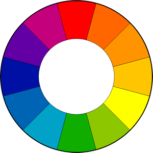
The color wheel is the basic tool for combining colors. First created by Sir Isaac Newton in 1666, today the most common version is a wheel of 12 colors based on the RYB (red, yellow, and blue) color model. These are the Primary Colors (red, yellow, and blue). Primary Colors are colors from which all other colors are derived. The next category is Secondary Colors (purple, green, and orange). These colors are formed by mixing the primary colors. Tertiary Colors are formed by mixing a primary and a secondary color, giving the color a two word name such as yellow-orange and blue-green. The Color Wheel is an important tool for any designer as it easily shows what colors go well together. Color harmonies are color combinations, consisting of 2 or more colors, that have a fixed relation on the color wheel. These combinations are considered pleasing to the eye. Harmony creates a sense of order and balance. It engages the viewer. The human brain rejects what it can not organize or understand. It seeks a visually balanced experience. When colors look good together, it’s believed that it makes people feel good. That is why color harmony is so important in branding.
Color Harmonies: Complimentary Color Scheme
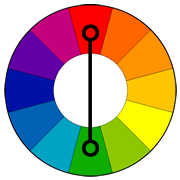
Colors that are opposite one another on the color wheel are called complimentary colors. Combining these colors creates a very vibrant combination because the contrast is high, but it can be tricky to work with. Complimentary colors work well when the design needs to stand out. Some examples of complimentary color schemes are purple and yellow, red and green, and blue and orange.
Color Harmonies: Analogous Color Scheme
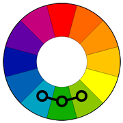
Analogous colors are next to each other on a color wheel. These colors match very well, but lack the high contrast of a complimentary color scheme. They are less vibrant. In design, this color scheme includes one dominant color, one supporting color, and one color used as an accent. Analogous colors are often found in nature, such as when the leaves change to their fall colors (red, red-orange, and red-violet). Another example of an analogous color scheme is light blue, green, and light green.
Color Harmonies: Triadic Color Scheme
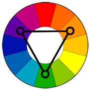
This scheme uses colors that are evenly spaced on the color wheel. This is a very vibrant color scheme. In design, it’s important to have balance when using a triadic color scheme. One color should be dominate, while the other two are used as accent colors. An example of a triadic color scheme is purple, orange, and green.

